Test phases analysis
Analyze and continuously improve your test phases.
Overview
When testing your product with multiple procedures and phases, it can be challenging to know where to focus your efforts when issues arise or improvements are needed. In TofuPilot, each test phase is tracked individually, allowing you to analyze areas that need attention—whether it's phases taking too long, those with low yield, or measurement drifts over time.
Single phase analysis
After a test run, go to the Phases table on the Run page to see details on the unit under test, procedure, attachments, report, and each test phase.
The Phases table includes each phase’s:
- name
- outcome
- duration (calculated as end_time_millis - start_time_millis)
- measurements’
- name
- value (number, string, boolean or abitrary JSON)
- upper and lower limits
- units (e.g., volts, degrees)
- outcome
This view lets you analyze each phase in detail for a specific run.
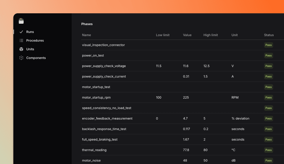
Click on a test phase in the Phases table to go to the Procedure page, where data is filtered by that specific phase.
Multiple phases analysis
It's also helpful to get an overview across all executed runs, which you can access on the Procedure page. This page provides key indicators in various tabs (e.g., Cpk, yields). Learn more in the Test analytics section.
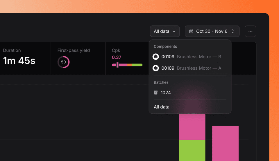
On the Procedure page, you can filter the indicators for runs within the same procedure by selecting parameters at the top right:
- Run date
- Stations name
- Unit under test component and revision
- Procedure version
- Unit under test batch number
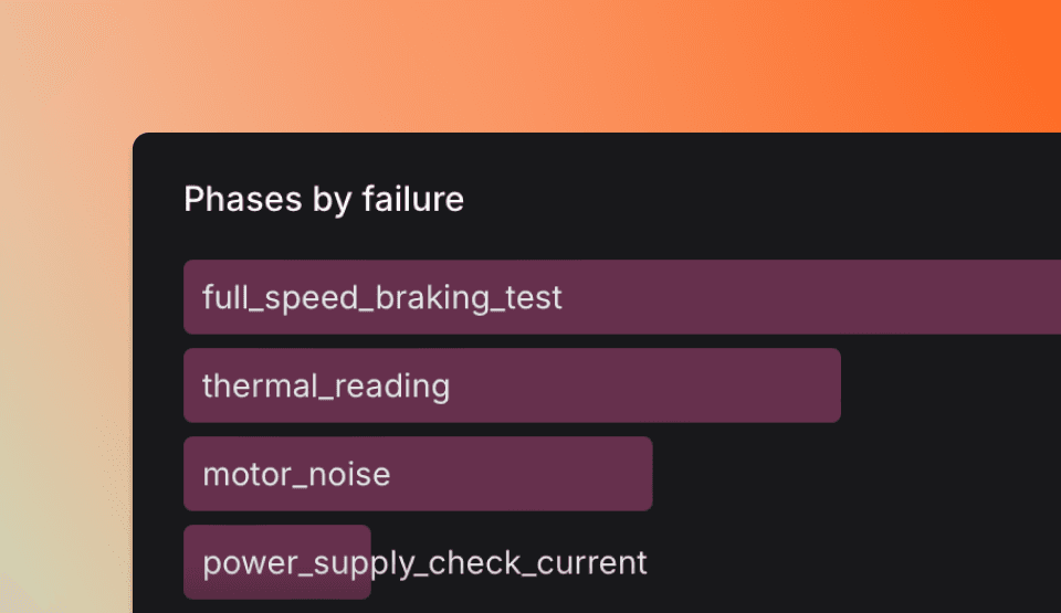
You can also filter by phase in the Phases by failure or Phases by duration tables below.
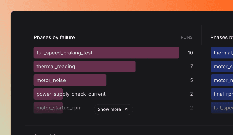
Click on a phase (e.g., "thermal_reading" or "motor_noise") to filter by it. To clear the filter, select Clear Filter.
Phases by failure and duration
This view helps you identify the most frequently failing test phases, making it easier to analyze defective parts or improve test procedures.
The Phases by failure table lists phases with a Fail status, sorted by frequency (from most to least failures).
The Phases by duration table displays phases sorted by duration, showing those that take the longest.
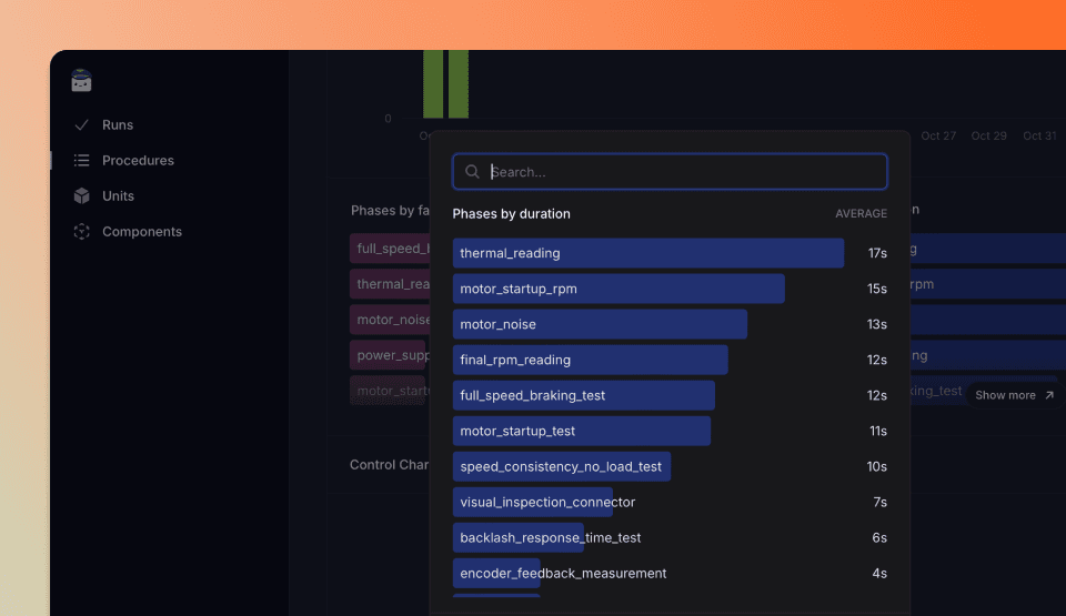
Control chart and histogram
You can explore a specific test phase with numerical or string data in the Control Chart below the Phases tables.
This chart displays all values for the selected phase over time, showing limits, an automatically calculated 6-sigma standard deviation, and the average.
The histogram, with a Gaussian overlay, helps you quickly spot values outside the standard range.
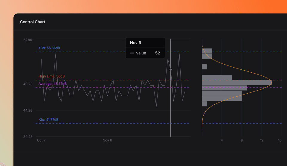
Click on a phase with numeric or text values to display the Control Chart.
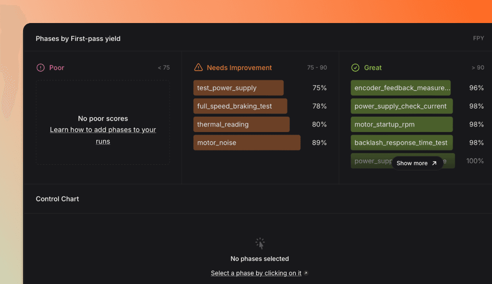
Phases by First-pass yield and Cpk
You can also view the First-Pass Yield and Cpk of each phase, helping you easily identify which test needs improvement to boost the overall yield. Keep in mind that the yield of a run is the cumulative result of all phase yields.
